Wednesday, April 19, 2006

April Journal Quilt


Several months ago when I was cleaning the junk in Bob's home office I found an envelope of pictures he took eight years ago while visiting our French friends in Grenoble. One was of an old apple tree (I think) in full bloom growing on the side of the hill silhouetted against an incredible blue spring sky. He composed the photograph perfectly. I saved this photo from the purge, and when I read about the journal quilts, thought it would be perfect for April. It's nothing special, just fused applique and my first attempt at rather heavy freemotion embroidery. The thread for the small branches is too dark, I think, and the twiggy effect doesn't fit with the abstracted "cloud" shape that I gave the blossoms. But it's not too bad for my first attempt at this sort of thing.

Tuesday, April 18, 2006

When That Aprille...

It's a top ten day here in Northern Indiana--temperatures in the upper 60's, not a breath of wind, and a sky so bright blue and cloudless that it practically sparkles. Tiny little buds are just becoming visible on our oaks and maples, and daffodils, flowering crabs, and Bradford pears are in full bloom. We finally had rain Sunday night, and the grass became brilliant green overnight. Even a yard-and-garden-work hater like me enjoyed pulling some weeds and spreading a little plant food. It's not a day for the basement!

Saturday, April 15, 2006


I finished this charity quilt yesterday and am very pleased with the way it turned out. I always feel so virtuous when I use up some of my endless scraps, and the green border was also "found fabric", left over from a backing on another quilt. The binding went smoothly this time too, thanks to the kind person on Quilt Studio who gave the tip about putting pins parallel to the binding instead of across it. I also used my old generic walking foot and not the Viking one, which worked so much better for this. I have enough of the pastel strips left to make another smaller quilt and will get to that soon.

Thursday, April 13, 2006


Here's a view of the little kingdom that gave my blog its name. My "studio" (when I was making things to sell, my family called it "the sweatshop", but "studio" is so much better spin) is, of course, in the basement. My son always says, "You need to get out of the basement, Mom", my other son just rolls his eyes, and my husband, Herr Doktor Professor, is basically oblivious to what I'm doing. But I'm happy here. The heart of the area is a former ping-pong table, raised on cement blocks. It's a great work table, because it's huge! I can cut, layer, and store all the materials for a work in progress on it. There's room for more storage underneath. Of course that means it's a mess. My machine, stash, and ironing board are near by, and the computer and a tv are at the other end of the room. I have room for two design walls, both now empty, because I'm not at that stage. There's also a window letting in a lot of natural light, even sunlight at some times of day. It's a great set-up for function, not much for looks. No matched storage units here!

Tuesday, April 11, 2006

Two more--


Two more quilts from Chicago that I particularly liked. After thinking about them, I've decided that what they have in common that appeals to me is simple elements used creatively. The first is Hopscotch in Zero Gravity, which was on cover of American Quilter I believe, so it's not new. It's so cheerful! I particularly like the simplicity of the scrappy strips put together in this effective, and really quite fascinating way. It probably doesn't show in the picture, but there is a shadow effect around the right hand edge of each of the squares, which adds depth, and the rick rack also is a special detail. The second is called Our Lady of the Lake, and again I don't know the maker. This quilt grows on me the more I think about it. First, I like the idea of using a familiar block as a background for the outline image, and then the color placement of the background tirangles creates a kind of glow. At first I thought there was a pattern on the black fabric forming the outline of the face, but it's really quilting done in variegated thread. The whole effect is beautiful, and somehow serene, so appropriate for the subject.

Saturday, April 08, 2006

International Quilt Festival

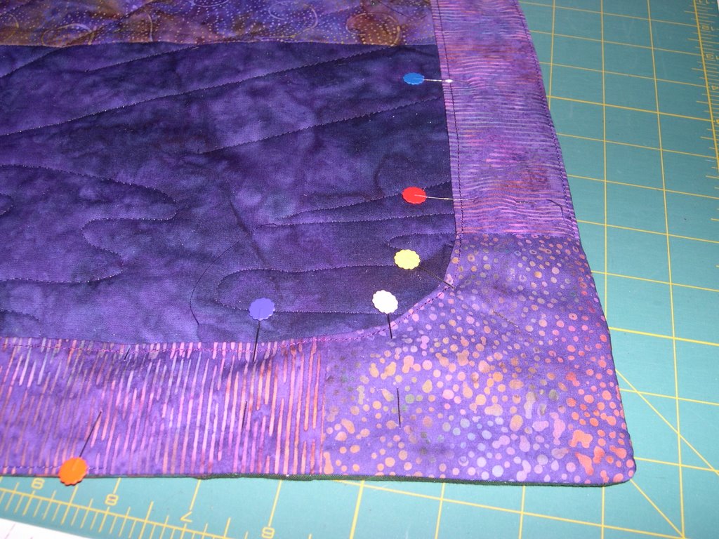
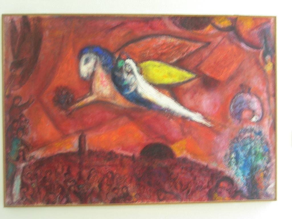
Here are a few of my favorite quilts from the International Quilt Festival in Chicago yesterday. I don't know the names of the quilters, having been very disorganized in taking the photos.

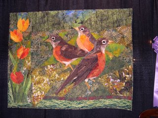
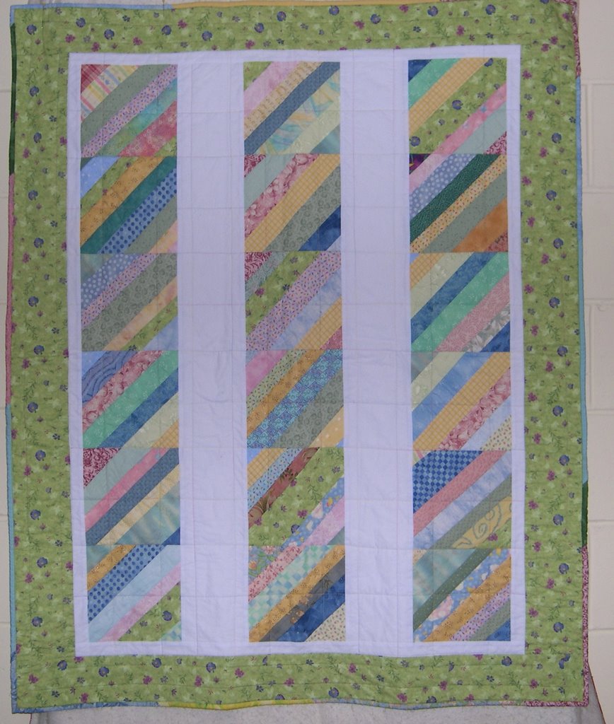
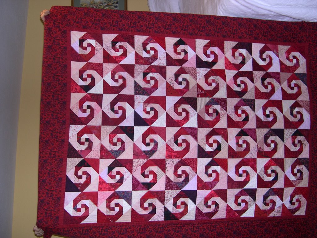
This one was best of show in the special exhibition, Welcome Spring.

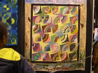
This was my favorite. I love the New York Beauty block, and the thing that makes this special is that it is all dotted fabrics and around the border is embroidered the words of Gerard Manley Hopkins' poem, "Pied Beauty", one of my favorites.
Glory be to God for dappled things--
For skies as couple-colour as a brinded cow
For rose-moles all in stipple upon trout that swim;

There are appliques of butterflies, trout, and other "spotted" creatures mentioned in the poem, as well as the "couple-colour" sky.


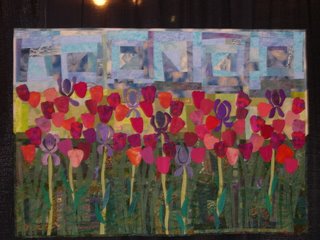
This is just plain beautiful. I like slightly abstract images from nature, and the colors are glorious. The log cabin block making the sky is very effective.

One of the parts of the show that I liked best was the quilts from the Husqvarna Viking challenge, and no photographs were allowed of those. These were very innovative and interesting contemporary quilts, some by well known quilters. No photographs were allowed of Men of Biblical Proportions either.

This show has the drawback of being extremely crowded. Some parts of the vendors section are almost impassible, and I lost patience with that quickly. I bought what I came to find: Misty Fuse, Paint Stiks, and Bo Nash, none of which I can get here, and then left the vendors. (Well, I did buy just a LITTLE bit of fabric--) That meant I went back and looked at the quilts again. It was interesting to discover that some of the people on our bus barely saw the quilts. No one saw the Viking challenge quilts. "I didn't have time to look at them all." We were there over 7 hours! So if you only buy patterns and kits, and don't even see the work of outstanding quiltmakers, what will your work be like? The answer to that is pretty obvious, I think.

Wednesday, April 05, 2006

Facing


I decided to put a facing instead of a binding on my Hoffman challenge quilt because I didn't think it needed that extra line made by the binding. I made the facing the way it is explained in Circle Play by Reynola Pakusich. Basically you cut strips of fabric the length of the sides minus the 4 inch squares for the corners, sew them together, curving the square to match the strips, sew the facing to the quilt with right sides together, turn, press, and sew down by hand. Here's the facing pinned on the right side, then stitched, turned, and pinned, and finally the finished product. (In reverse order --thanks Blogger) This wouldn't look right on every project of course, but I found it easier than fussing with mitered corners.

Sunday, April 02, 2006

Just looked at my Equilter newsletter which arrives on Sunday morning. They're featuring a new collection of Asian inspired fabrics by Lonni Rossi. They're beautiful--huge abstract chryanthemums that look almost like paint splotches, in luscious reds and golds and earth tones with coordinating kanji print fabrics and other Asian designs. They also have her older fabrics. I love the vegetable line--like block prints or linoleum stamps of corn kernals, broccoli stems, mushrooms. My description is lame--go see them. I have trouble knowing what to do with them, but they're beautiful.

Saturday, April 01, 2006

I found this on Lolly's blog.

Meme instructions: Look at the list of books below. Bold the ones you've read, Italicize the titles you might read, cross out the ones you won't, underline the ones on your book shelf, and place parentheses around the ones you've never even heard of.

I'll repeat her instructions and say you're tagged if this interests you.


The Da Vinci Code - Dan Brown
The Catcher in the Rye - J.D. Salinger
The Hitchhiker's Guide To The Galaxy - Douglas Adams
The Great Gatsby - F.Scott Fitzgerald
To Kill a Mockingbird - Harper Lee
The Time Traveler's Wife - Audrey Niffenegger
His Dark Materials - Philip Pullman
Harry Potter and the Half-Blood Prince - J. K. Rowling
Life of Pi - Yann Martel
Animal Farm: A Fairy Story - George Orwell
Catch-22 - Joseph Heller
The Hobbit - J. R. R. Tolkien
The Curious Incident of the Dog in the Night-time - Mark Haddon
Lord of the Flies - William Golding
Pride and Prejudice - Jane Austen
1984 - George Orwell
Harry Potter and the Prisoner of Azkaban - J. K. Rowling
One Hundred Years of Solitude - Gabriel Garcia Marquez
Memoirs of a Geisha - Arthur Golden
The Kite Runner - Khaled Hosseini

The Lovely Bones - Alice Sebold
Slaughterhouse 5 - Kurt Vonnegut
The Secret History - Donna Tartt
Wuthering Heights - Emily Bronte
The Lion, the Witch and the Wardrobe - C. S. Lewis
Middlesex - Jeffrey Eugenides

(Cloud Atlas - David Mitchell)
Jane Eyre - Charlotte Bronte
Atonement - Ian McEwan

The Shadow Of The Wind - Carlos Ruiz Zafon
The Old Man and the Sea - Ernest Hemingway
The Handmaid's Tale - Margaret Atwood
The Bell Jar - Sylvia Plath
Dune - Frank Herbert


I've actually read part of the others too, but if someone were to ask what I've read recently, the list would be very short. I quilt instead. Amazing change for a life-long bookworm and former English teacher.

Friday, March 31, 2006

Tree Hugger


I decided to send this little piece to the Quilt University on-line show. I made it very quickly and didn't really think too much of it, but it has grown on me. I like the forest creature look of it. The assignment was to make a line scribble and then translate it into fabric somehow. This scribble started out as a picasso-type profile silhouetted against a triangle, which looked like a tree. When I did it in fabric, I kept that idea in mind when choosing a color scheme, although the "tree" shape is now beige. But I still see the face, and I strengthened it by adding the bead for an eye. I've called it Tree Hugger.

Thursday, March 30, 2006

It's truly spring today, the first day! Sixty five and sunny! I survived my French class with no real problems, finished the bobbin work that I have been obsessing over for the last three days, and so I'm very happy.

Here they are, after all my agony. Those little shapes are barely visible, but that's what I wanted, and they look smooth, straight and even, and I think will set off the quilting. As I finished them, I realized that to achieve these very inconspicuous little embellishments I took a class from Libby Lehmann, bought a machine embroidery hoop (expensive), bought several different spools of Razzle Dazzle thread, and agonized for two days, trying colors, designs etc. Was it worth it? I guess, because for the moment I am satisfied.

As a technique note, using the embroidery hoop makes free motion work much easier, because having something to steer the fabric by makes the movement smoother. It's a pain to put fabric in and out however, and to maneuver the hoop under the needle. I also liked the Razzle Dazzle thread. On my machine it worked in the bobbin very easily with no tension problems. It looks better in straight stitching than free motion because you can make longer stitches that show up the texture more, but free motion is ok.


Wednesday, March 29, 2006

Francais

I have been studying French today. (Some quilting too.) We're spending a month in Paris in May and part of June and hoping to be a bit better at French than I was last year, I signed up for a conversational French class at a place called Forever Learning Institute. As the name suggests, it's for people over 50. I am about the youngest student, and also the weakest. And to make it worse, because of family issues I have missed the last two classes and don't even know what we're doing tomorrow. (No way to contact teacher.) So I expect to be a bit humiliated as those septugenarians run rings around me (linguistically of course). The whole thing is taking on a nightmarish quality, like those anxiety dreams where you haven't been to class all semester and don't know where the final is. Zut alors!

Sunday, March 26, 2006

A Year Ago...


It was just a year ago that we left for our trip to South Africa, and I have been looking through my pictures, and decided to post a few. First is one for fabric people: this is a booth in the Greenmarket Square in Capetown selling mud cloth. This isn't a South Africa cloth, but comes from other countries, including Uganda and the Congo. It's all natural dyes and the designs are appliqued on to the base. I bought only a small pillow cover from this because of the bulk. Then--since everyone posts pictures of their cats--here's a cat of another kind. We visited a cheetah breeding facility (cheetahs are endangered, which I didn't know), and for a fee you could pet a cheetah. Pretty hokey, and actually I was rather afraid to do this, but my husband talked me into it, so here I am, gingerly petting that cat! He was actually quite bored by the whole thing, a typical cat. I could even hear him purring.


This is Table Mountain, in the heart of Capetown, taken from Kirstenbosch Botanical Gardens on the inland side. The next picture is a view of Capetown taken from the boat returning from Robben Island, a former prison during the Apartheid period. It is now a museum, and tours are conducted by former prisoners, who describe their experiences. An incredible experience to take this tour and consider the almost miraculous changes that have happened so rapidly there. And to give a taste of the less scenic side of Capetown, here is one of the "informal settlements" put up by the people who are flooding into the city from the countryside, a growing problem for South Africa.

I tried to give some hint of the varied things we saw. We did see wild animals too, but my camera just wasn't able to do them justice.

Sunday, March 19, 2006


I have been tearing my hair about the binding of the wall hanging I' m making, so I stopped and did the quilting on this charity quilt.

I have such a love-hate relationship with my Viking 545. It does beautiful stitching, but the controls and some of the feet are so badly designed. For instance, the quarter inch foot has no "play" so although it works great for stitching two layers of fabric together, it stalls when I piece a block. Does this make sense? What is this foot for, anyway? Isn't it for quilting? So why isn't it designed to piece blocks? Another gripe is the shape of the walking foot. It is hard to see the edge of the fabric, so when I am stitching on a binding the seam allowance is a little wide, and so the binding ends up narrow and needs to be forced over the edge. I know I could cut the binding wider, but I am just beginning to understand what is going on and why I have this trouble. I also cannot do a machine stitched binding because the open toes of the walking foot don't flatten the binding. I had no trouble making bindings with the old machine. In fact, I am going to use the old generic walking foot for bindings in the future. I did that on this charity quilt, and it worked so much better. And then the controls--little tiny buttons that have to be hit just exactly right or they don't work. So when you think you are backstitching, you aren't!

Anyone else have this machine? Do you have problems with it? Is it just me?

Wednesday, March 15, 2006

Reds and Pinks

The other day I discovered the color spectrum project. This project is mostly for knitters, but there are quilters trying it too. The colors for March are reds and pinks, my favorites. I'm not going to be doing a new red/pink project, so here is my red snail's trail quilt from several years ago. It was fun to collect fabrics for this, and I learned some things. I first used pinks for the light red, but couldn't stand so much pink,so I added red and white prints to cut the "sweetness". I also added some purples and lavenders to make the whole thing a little less warm, but it's still a red quilt.

And, since Lolly encouraged colors from nature or art, here's one more. There's no red in nature in northern Indiana in March, but here's a Chagall painting I saw last summer at the museum in Nice. I took the picture to remember the color combination. In reality, it's glorious. I just read that Chagall said his paintings had no meaning except light and color, and that is so true of the red ones in this series. Here there's a blur and bad color reproduction because I had to use such a slow shutter speed, but I hope the picture gives some idea. Doesn't that acid yellow just bring the whole thing to life?

Not a total dummy--

You Passed 8th Grade Math

Congratulations, you got 8/10 correct!

Frustrations

Started quilting the parrot wall hanging I made a few weeks ago. I did a pattern of concentric circles with a walking foot, and although I was worried about how hard that might be, the stitching went very smoothly because the piece is so small. But I don't like the way it looks. I don't seem to be able to master all the quilting decisions: thread, batting, design. This isn't the first time I have had a top I like and then felt I spoiled it with quilting. What's really frustrating was that I used a batting I've used before and liked (Quilter's Dream Blend) and a pattern I used before on a quilt with the same design. But this time I don't like the result. Maybe when the marks are gone and it has been dried and fluffed I'll be happier. No picture of this thing, at least not yet!

Also spent a frustrating time preparing for my French class tomorrow. I am taking Intermediate Conversational French at a place called the Forever Learning Insitute. (If the name makes you picture a classroom full of "mature" students, you're right!) I am not the youngest in the class, but am definitely the slow one--these seventy- and even eighty-year-old ladies put me to shame. I have forgotten so much! Last week was particularly bad because I had been away the week before and didn't know what had been assigned. I'm ready for tomorrow, but may have to miss again because of my husband's doctor's appointment. (I'm designated driver.) Argh!! I hope to be able to get the assignment this time, at least, so next week I won't be totally humiliated.

Saturday, March 11, 2006

The Wearing' of the Green


Here's the Chicago River dyed green for Saint Patrick's Day. I took these pictures from the Michigan Avenue bridge last year actually, but just about now the men from the plumber's union are in their boat, dispensing their secret-formula green dye to color the river. I had heard of the green river, but pictured something sort of sick and brownish, not this incredible emerald. I remembered the river this morning because we are going into Chicago later today to go to the opera and spend the weekend with my son and daughter-in-law in Evanston. We'll miss the St. Pat's festivities this year, but it's a great memory.

Friday, March 10, 2006


These are two postcards I made as work in my Quilt University class. Not bad, not great. I made the one on right first, decided the trees/lines were too stumpy, so I made the second version. On the second I used Angelina fibers to make snow. Or I should say I tried to, but when I fused the card to the innerfacing, the irridescence disappeared, and the Angelina fibers are basically invisible. Obviously a new technique is needed for that. Live and learn. I do like the shadow effect with thread painting though. I'm still working on improving binding on these little devils also. The second one is better because I cut the binding wider to cover the thickness of the innerfacing. I know some people overcast, but my machine won't do that well, so I'm stuck with binding.

Wednesday, March 08, 2006

Done!


The rows are finished, and this can go to be quilted. I like it--it's a very traditional looking kind of quilt, although the pattern is unusual. I don't know what it's called; it's a log cabin variation that I saw a partial picture of in a magazine, and figured out how to do it. I don't know how it got so big (I could say that about my sons, too!). I meant to make it double or queen size, but this is a real king. I guess I added border blocks to make the design look right without realizing what was happening to the size.