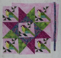
Have been considering parrot layouts until I am cross eyed and braindead. I have no idea what to do at this point, and am frustrated that all the options I have considered are very similar to my original idea, which must indicate a lack of ability to think outside the box or something. First idea was the big star, which seemed too dark and stood out too much. Then I tried a fussy cut big print to add interest, but that seems too busy, Then I considered the green star. And finally a combination. I'm leaning to that one because it seems to have a bit of a transparency effect, and picks up the parrot colors without overwhelming them.


Today I think I will let this project chill and do something else, and perhaps inspiration will strike or at least I can make a decision and move on.


2 comments:
I like the mixed colors better too. Jen
I love the parrots! What contest is it for?
Judy L.
Post a Comment