

Weeds 8" x 10"
Altered image photo transfers, hand dyed fabrics, fibers
Machine applique, machine quilting
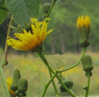
The photo for our last Interpret This! photo challenge shows river weeds and grasses.

I wanted to use the yellow flower as my focal point, and also to emphasize the diagonal lines of stems and grasses. This could have been done with applique, but I thought I'd try photo transfers this time.
I tried many different approaches, and although I didn't use most of them, it was an interesting experience. I'll summarize some of the things I did, and although they may be familiar to many people, it seems there are so many possibilities with this software that you may find something you haven't tried.
First, does everyone know that if you edit and save an image repeatedly you should not do that in JPG format, but instead use PSD or TIFF? I found this out fairly recently. Apparently a JPG looses quality somehow every time you save it. So do the altering in one of the other formats and then go back to JPG to post.
After cropping the flower section, the first thing I did was clean up the background around the flower by taking out some extra stems and buds. I used the Clone Stamp tool. You select that tool from the tool bar on the side of the screen, choose a size from the brush settings at the top, roll the brush circle over a section of the photo that will replace the part of the image you wish to remove, and Option Click. Then put the circle over the part of the image you want to remove, and click. The background you have selected replaces part of the image. You can click repeatedly until the part you want to erase is gone. It's good to Option Click on a new background occasionally to get a smoother fill. As you can see from the examples, this is a rather crude method and wouldn't work if you wanted a sharp finished photo, but for most fabric transfers it works fine.

The next step was to make the flower sharper and brighter. There are several filters that work for this, but I used the Watercolor Filter. Choose the Filter pulldown menu, and the filter you want to try. On Photoshop I use the Filter Gallery option, which shows me several filters at a time. (Filter-Filter Gallery-Watercolor) Like all the filters, Watercolor allows you to adjust several different sliders to get the best effect. Just play with it. After applying the filter and saving it, I chose Filter-Sharpen-Unsharp Mask, and set the radius slider at about 130. As I understand it, this increases the contrast between the pixels and can make the object stand out brighter. Here's the flower after those two steps.

The final step is to go to Image-Adjustments-Hue/Saturation. From the pulldown menu at the top of the window, I selected Yellows and increased the saturation by 30%. The image looks garish on the screen, but because cloth absorbs lots of ink, the extra brightness is needed. (The version below has also been resized and slightly distorted.)

The background required more trial and error. I wanted to use actual photos of the background, but the photo was so busy that it didn't allow the flower to stand out much. There are lots of fills that can change the color, but I wanted to keep the greens.
First I selected the left half of the image, copied it, pasted it in a new layer, and flipped the image so I only had the diagonal stems.

Then I tried different filters to blur or soften the busyness of the background. Here is a spray filter (Filter-Brush Strokes-Spray Strokes) with a green fill layer. Pretty but not right for what I wanted.
 Here is the final choice. It's the stamp filter (Filter-Sketch-Stamp) with the foreground color set to match the darkest green in the photo and the background color set to approximate a fabric I planned to use.
 If I were doing it over, I'd make the foreground darker, I think.
For all these trials, I printed a sample on paper to see the general effect, and used the paper copies to plan a layout. After deciding on a final plan, I upped the saturation (Image-Adjustments-Hue/Saturation) and printed on fabric. I printed the flower on a purchased silk fabric sheet, hoping the luster would make the flower clearer. I'm not sure it did. The background is cotton pretreated with Bubble Jet Set and attached to a postage label.
Everything I've done here is pretty basic; for this project, I didn't even try some of the various fill effects possible, or the selection tools to cut out the flower from the background. There's so much trial and error in using these techniques you could spend months doing this. I'm not sure I want to, but this was fun.


The next step was to make the flower sharper and brighter. There are several filters that work for this, but I used the Watercolor Filter. Choose the Filter pulldown menu, and the filter you want to try. On Photoshop I use the Filter Gallery option, which shows me several filters at a time. (Filter-Filter Gallery-Watercolor) Like all the filters, Watercolor allows you to adjust several different sliders to get the best effect. Just play with it. After applying the filter and saving it, I chose Filter-Sharpen-Unsharp Mask, and set the radius slider at about 130. As I understand it, this increases the contrast between the pixels and can make the object stand out brighter. Here's the flower after those two steps.

The final step is to go to Image-Adjustments-Hue/Saturation. From the pulldown menu at the top of the window, I selected Yellows and increased the saturation by 30%. The image looks garish on the screen, but because cloth absorbs lots of ink, the extra brightness is needed. (The version below has also been resized and slightly distorted.)

First I selected the left half of the image, copied it, pasted it in a new layer, and flipped the image so I only had the diagonal stems.

Then I tried different filters to blur or soften the busyness of the background. Here is a spray filter (Filter-Brush Strokes-Spray Strokes) with a green fill layer. Pretty but not right for what I wanted.


For all these trials, I printed a sample on paper to see the general effect, and used the paper copies to plan a layout. After deciding on a final plan, I upped the saturation (Image-Adjustments-Hue/Saturation) and printed on fabric. I printed the flower on a purchased silk fabric sheet, hoping the luster would make the flower clearer. I'm not sure it did. The background is cotton pretreated with Bubble Jet Set and attached to a postage label.
Everything I've done here is pretty basic; for this project, I didn't even try some of the various fill effects possible, or the selection tools to cut out the flower from the background. There's so much trial and error in using these techniques you could spend months doing this. I'm not sure I want to, but this was fun.
4 comments:
I absolutely love your interpretation. Every detail of it. Thanks for sharing the photo shop processs. It's so handy to learn about new stuff and then tuck it away for when you might need it next.
I can certainly see the value of these experiments as little Alzheimer pieces.
Wow, look how you did this. I've said this before in other posts but I'll say it again - I admire your willingness to play with new techniques. When Mom was here last weekend I shared with here the Black and White Texture studies explaining how that process was with the book and teaching yourself new things. Being a creative Art sewer (not quilter) she really admired the work and willingness as well. I think I forgot to share this cool moment actually. Glad that just came up.
I love the diagonal movement in your piece. The technical learning curve on these kinds of projects is significant, and you've put your knowledge to good use.
Post a Comment