Tuesday, January 25, 2011

The Batik Blur

I used to love batiks.  When I started making "wearable art" about 12 years ago, batiks were new to me, and they were perfect for what I was doing. 
 The low value contrast and blended colors worked for quilted  clothing, because after all, not many people want to look like they're wearing one of Grandma's quilts.  Some of my batik stash dates from that period, but I've added to it constantly, finding uses for some of it, but always thinking "Some day I'm going to do something wonderful with these batiks!"

In the last few months, it's been dawning on me that I no longer like batiks so much.  They've become much more common, and often are used in such a way that their already blended look becomes just a blur--there's no pattern left in the quilt.  The popular jelly rolls are very much to blame for this.  Many batik jelly roll quilts seem to me like a big smudge of finger paint--pretty colors, but without any pattern definition.  Now if you love jelly roll batik quilts, I know I'm stepping on your toes.  Don't take it personally.  You can still love them.  It would be a dull world if we were all alike, right?

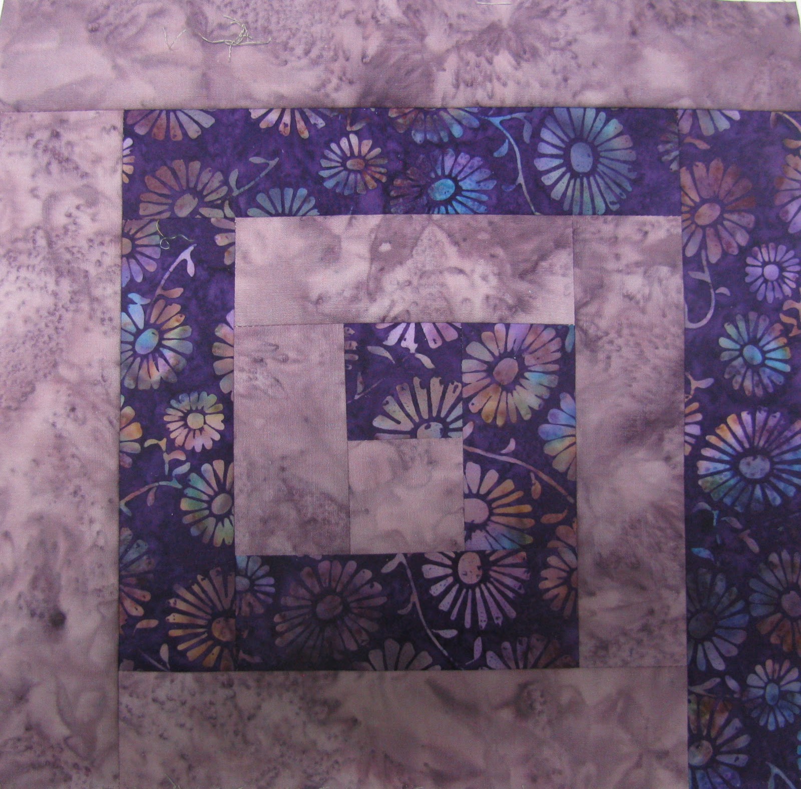
So--DRUM ROLL:  It's time to use up some batiks! ( It's not that I don't like them at all, it's just that I'm not "saving" them any longer.) I'm making Athena's Puzzle, from a pattern I bought at the Chicago Quilt Festival last spring with the aim of busting batiks.  I love the Greek Key design, so that's a bonus, and it's actually just a simple Courthouse Steps block.

I have a retreat coming up in two weeks, so I'll cut this out and sew it there, and will have reduced the batiks stash noticeably.  The quilt will be fairly blurry, but that's okay.  Nine yards of fabric, plus backing and binding will have been finally used.

I keep repressing the voice that says, "You're going to want that blue for sky!  That blue-green has been perfect as an accent.  No! Not that purple!  You'll be sorry."  So far it's working.

Friday, January 21, 2011

It's Still January

Greetings from the tundra.


What's happening:

I'm preparing these three Interpret This! pieces to send to the Alzheimer's Quilt Initiative.  Two of them need a sleeve, since I didn't do that when they were finished.  The pink tree has been cut smaller to meet the AAQI size limit, without any impact on its effect that I can see.

The service quilt that was posted last week is quilted, bound, and ready to go.

I've also been reading, finishing the Inspector Troy novels by John Lawton.

  These are an odd combination of police procedural, cold war espionage, and historical novel, since they're set in London at  various times from the Blitz to 1963.  Lawton wrote four novels, the fourth bringing his hero Inspector Troy to the end of his career, and then apparently not really finished, wrote subsequent novels that went back and filled in gaps in Troy's life.  I'd highly recommend these books.  Troy is a fascinating,  not totally likable character; as the son of a family of aristocratic Russian refugees, he's a bit of an outsider in England. There's an excellent cast of supporting characters, as well as vivid descriptions of English society at various time periods.

What's not happening:

I signed up for a Quilt University course, Playing with Paint, taught by Lyric Kinard.  I debated a long time about taking this class, but finally decided it might motivate me to use some of the fabric paint that is sitting on my shelf.  I've bought the paint because other people make such beautiful things, but after the paint comes into my house, it usually sits untouched.

Stupid as it sounds, I just don't like the mess.  Clutter is okay, but I don't like to get my hands dirty, or spill stuff that has to be wiped up, or wash paint tools.  In addition, if there's anything that says "bad art everyday" it's my painted fabric.  I look at it, and think, "Now what?"  So last Friday I downloaded the first lesson,  read it,  and haven't opened a jar of paint!  I will do the class work; I promise.  Just not yet.


Tuesday, January 18, 2011

Ah, Winter


January

The days are short, 
The sun a spark
Hung thin between 
The dark and dark.

Fat snowy footprints 
Track the floor,
And parkas pile up
Near the door.

The river is
A frozen place
Held still beneath
The trees' black lace.

The sky is low, 
The wind is grey.
The radiator
Purrs all day.

John Updike


Don't be fooled; the vision at my house is much more like the images in the second stanza of the poem than the lovely photo.   I would add to the picture: puddles on the garage floor from snowy cars,  wood trash and ashes near the fireplace, and extra floor mats to prevent those wet, snowy footprints.  I give up.  In addition, it's thawing today: grey mist, dripping water, puddles that will refreeze into sheets of ice, and dirty snow.

I spent the morning going through excess STUFF in the basement around my studio area.  The progress is not even noticeable.  I'll keep going.  The plan is to buy some new storage furniture to neaten it up, but first I had to throw out boxes, shopping bags, and tissue paper saved after Christmas.  And that's just the beginning.

I hope in the time left this afternoon I can do something creative, in the spirit of Bad Art. Everyday.  Click on the button for the link to Libby's blog where she explains this philosophy.  It's not what you think.  Join in!


Friday, January 14, 2011

December/January Interpret This!


Weeds 8" x 10"
Altered image photo transfers, hand dyed fabrics, fibers
Machine applique, machine quilting

The photo for our last Interpret This! photo challenge shows river weeds and grasses.


I wanted to use the yellow flower as my focal point, and also to emphasize the diagonal lines of stems and grasses.  This could have been done with applique, but I thought I'd try photo transfers this time.

I tried many different approaches, and although I didn't use most of them, it was an interesting experience.  I'll summarize some of the things I did, and although they may be familiar to many people, it seems there are so many possibilities with this software that you may find something you haven't tried.

First, does everyone know that if you edit and save an image repeatedly you should not do that in JPG format, but instead use PSD or TIFF?  I found this out fairly recently.  Apparently a JPG looses quality somehow every time you save it.  So do the altering in one of the other formats and then go back to JPG to post.

After cropping the flower section, the first thing I did was clean up the background around the flower by taking out some extra stems and buds.   I used the Clone Stamp tool.  You select that tool from the tool bar on the side of the screen, choose a size from the brush settings at the top, roll the brush circle over a section of the photo that will replace the part of the image you wish to remove, and Option Click.  Then put the circle over the part of the image you want to remove, and click.  The background you have selected replaces part of the image.  You can click repeatedly until the part you want to erase is gone.  It's good to Option Click on a new background occasionally to get a smoother fill.  As you can see from the examples, this is a rather crude method and wouldn't work if you wanted a sharp finished photo, but for most fabric transfers it works fine.


The next step was to make the flower sharper and brighter.  There are several filters that work for this, but I used the Watercolor Filter.  Choose the Filter pulldown menu, and the filter you want to try.  On Photoshop I use the Filter Gallery option, which shows me several filters at a time. (Filter-Filter Gallery-Watercolor) Like all the filters, Watercolor allows you to adjust several different sliders to get the best effect. Just play with it.  After applying the filter and saving it, I chose Filter-Sharpen-Unsharp Mask, and set the radius slider at about 130.  As I understand it, this increases the contrast between the pixels and can make the object stand out brighter.  Here's the flower after those two steps.

The final step is to go to Image-Adjustments-Hue/Saturation.  From the pulldown menu at the top of the window, I selected Yellows and increased the saturation by 30%.  The image looks garish on the screen, but because cloth absorbs lots of ink, the extra brightness is needed.  (The version below has also been resized and slightly distorted.)


The background required more trial and error.  I wanted to use actual photos of the background, but the photo was so busy that it didn't allow the flower to stand out much.  There are lots of fills that can change the color, but I wanted to keep the greens.

First I selected the left half of the image, copied it, pasted it in a new layer, and flipped the image so I only had the diagonal stems.


Then I tried different filters to blur or soften the busyness of the background.  Here is a spray filter  (Filter-Brush Strokes-Spray Strokes) with a green fill layer.  Pretty but not right for what I wanted.
Here is the final choice.  It's the stamp filter (Filter-Sketch-Stamp) with the foreground color set to match the darkest green in the photo and the background color set to approximate a fabric I planned to use.
If I were doing it over, I'd make the foreground darker, I think.

For all these trials, I printed a sample on paper to see the general effect, and used the paper copies to plan a layout.  After deciding on a final plan, I upped the saturation (Image-Adjustments-Hue/Saturation) and printed on fabric.  I printed the flower on a purchased silk fabric sheet, hoping the luster would make the flower clearer.  I'm not sure it did. The background is cotton pretreated with Bubble Jet Set and attached to a postage label.

Everything I've done here is pretty basic; for this project, I didn't even try some of the various fill effects possible, or the selection tools to cut out the flower from the background.  There's so much trial and error in using these techniques you could spend months doing this.  I'm not sure I want to, but this was fun.


Wednesday, January 12, 2011

Snowbound Service Quilts

I've been semi-snowbound for a week or so.  I can get out, but haven't really wanted to.  The South Bend area had a record snowfall last weekend, 38.6 inches.  It's snowing again, and probably will for several days. Although there isn't that much snow where I live, (maybe about 20 inches), going anywhere is a hassle.  So I've stayed in,  and done some scrap strip reduction.  Both these quilts are service quilts for my guild; when the second one is quilted, I'll have five to turn in.  


I've been in a sort of brain-dead mode lately, and putting these things together has been just what I need. Bright colors brighten up the winter too!

Wednesday, January 05, 2011

Observations of a Lurker

I've been doing lots of lurking lately; for whatever reason, I haven't felt very sociable, so I haven't commented (or posted) much, but I do read.  As I read, I started to divide quilting bloggers into categories.   Most bloggers tend to drift and don't fit in the same category all the time, but everyone has a default setting.  See if you agree with my list.

The Neighborly Blogger    Reading this kind of blog is like going back to the old days when you could chat with your neighbor over the back fence or stop in for coffee while walking the dog.  She will show what she's working on, talk about her day, show pictures of her children, pets, or grandchildren.  This is probably the most common type of blog.

There are subtypes in this group: the Bossy Neighbor, who will give you a pattern to follow along with step by step, or the One Up Neighbor who always seems to have a nice new "toy" to play with or have been somewhere exotic or maybe just has cuter grandchildren.

The Trendy Blogger  Here's where you find out all about the latest "in" stuff.  The word of the year, the sketchbook challenge,  the "let's all post the same thing on the same day" sort of game. The beginning of the year is a big time for trends, but many of them fizzle pretty quickly.  Still it's good to be in the know, and if you're in a passive, observing mood like me, watching the world of trends go by is fun.

The Instructive Blogger  Want to learn a new embroidery stitch, how to make a perfect mitered corner, how to make a stencil out of stale bread?  Someone out there can tell you, with pictures or a video, and maybe sell you a book or a pattern too.    These blogs are a service; they're part of what the Information Superhighway is all about.

The Philosophical Blogger  Is what I'm doing Art, or just Craft?  How can I grow on my Artistic Journey? When will fabric reach its deserved place as a Medium?  These bloggers meditate on the Big Questions.  The sub-type of this blogger is someone who disagrees, maybe snarkily, with other bloggers' answers to these Big Questions.  I love these people!  Seriously.  And I really love the snarky ones.

The Informative Blogger  Here you'll find lots of pictures of quilt shows, shops, new fabric lines, or links to other interesting blogs.  These bloggers help spread news the rest of us want to know.  They must be the blogosphere's  gossipy neighbor.

The blogging world has as many different personalities as the real world.  Did you recognize yourself in any of these descriptions? I did.  Sorry, I can't help it if my grandchildren are the cutest!